Dynamics Mobile Studio provides visual designer of the mobile screens (a.k.a. views).
It uses a well-known concept, where the developer have a design pane and a toolbox containing a list if controls. The developer can drag and drop the controls from the toolbox over the pane to design the layout of the mobile screen.
Layout
The layout control is used to group other controls inside. It can be dragged on the design surface and then other controls can be dragged inside. The inside controls can be stacked side by side or arrange in any other way by setting their STYLE property with valid css rules.The layout control is rendered as DIV during runtime
The layout control is rendered transparent by default.
Label
The label control allows the developer to place a static text over the design surface.
The control can be dragged onto the design surface and the Label property can be set
Text Field
The text field control contains two sub-conrols – label and text (or value). It is used ussually in forms to display a static text with a description before the text. The following data-binding can be used to bind the textbox value to a property from the data model:
value: LabelText
And here comes the data-model:
dataModel:function(){

var me=this;

this.LabelText = ko.observable('initial value');

}
Note that in this way if you change the value of LabelText from code, the label will render the new value automatically.
Text Box
The text box control contains a label and a textbox. It is used to allow the user to enter text data. The developer can use the following binding to change the type of the textbox, which is rendered as a different control on some devices.
attr:{type:'date'}: to force a date picker

attr:{type:'datetime'}: to force a date and time picker

attr:{type:'numeric'}: to force a numeric input only
The following data-binding can be used to bind the textbox value to a property from the data model:
value: myTextBoxProp
And here comes the data-model:
dataModel:function(){

var me=this;

this.myTextBoxProp = ko.observable('initial textbox value');

}
Note that in this way if you change the value of myTextBoxProp from code, the text box will render the new value automatically. If the user enters a value in the textbox , it will update the myTextBoxProp property value.
You can take the text box value by using the following code:
var theText = $('#myTextBox').text();

or set new text:

$('#myTextBox').text('some text...');
The code suppose that the Id of the textbox is myTextBox
Search
The search control renders a text box allowing the user to enter a text and click a button or press ENTER to start the search process. This will trigger an event called search.
The developer have to write the following data binding in order to attach his method to be invoked, when the user performs search:
event:{search:findCustomers}

and define the findCustomers method in the data model like this:

dataModel:function(){

var me=this;

this.customers = ko.observableArray();

this.findCustomers=function(ev){

var textToSearch = ev.data;

$ma.bo.SLA.Customer.fetchAll("[Name] like '"+textSearch+"'"," [Name] asc", 100,function(cusotmers){

me.customers(matchingCustomers);

});

}

}
Text Area
The textarea control renders a text area where the user can enter a text spanned across several lines.
value: myTextAreaProp
And here comes the data-model:
dataModel:function(){

var me=this;

this.myTextAreaProp = ko.observable('initial textbox value');

}
Note that in this way if you change the value of myTextAreaProp from code, the text area will render the new value automatically. If the user enters a value in the textbox , it will update the myTextAreaProp property value.
You can take the text area value by using the following code:
var theText = $('#myTextArea').text();

or set new text:

$('#myTextArea').text('some text...');
The code suppose that the Id of the textarea is myTextArea
Combo Box
The combobox control renders as a label and select html element. The combo box ( or dropdown list ) allows the user to select only one option from muluple options.
The combobox can be data-bound to the data-model in the following way:
options: myOptions, optionsCaption: "Select an item...", value: selectedId, optionsText:Title,optionsValue:Id
and we have the following data model
dataModel:function(){

var me=this;

this.selectedId = ko.observable();

this.myOptions = ko.observableArray({[Id:1,Title:'Title1'],[Id:2,Title:'Title2'],[Id:3,Title:'Title3']});

}
The combobox will be populated with the objects in the myOptions array ( 3 in this case) , because we have specified the options:myOptions binding stating that the comobo should be populated from the myOptions poperty.
The combo will display the Title property of each of the objects in the array because we have specified the following binding: optionsText:Title and will consider the Id property of the objects as value because of the optionsValue:Id binding
When the user selects an object from the combox, the value in the selected object’s Id will be written into the selectedId property of the data model because of the value:selectedId binding.
The combo will display “Select an item…” text when rendered because of the optionsCaption:”Select an item…” binding
Check Box
The checkbox control renders a checkbox ( ) during runtime.
The checkbox can be data-bound to the data model with the following data-binding expression:
checked: myBoolProperty
having the following data model:
dataModel:function(){

var me =this;

this.myBoolProperty = ko.observable(true);

}
This will render the checkbox checked or unchecked depending on the value in the myBoolPoperty property. If the user changes the state of the checkbox it will update the myBoolProperty property value
The developer can get the value of the checkbox assuming the checkbox Id is myCheckBox:
var isChecked = $('#myCheckBox').prop('checked');
and can change the checked/unchecked state by using this code:
$('#myCheckBox').prop('checked',true); //make it checked
$(‘#myCheckBox’).prop(‘checked’,false); //make it unchecked
Button
The button control is rendered as a button during runtime. The developer can attach a method to be called when the button is clicked by using the following data-binding expression:
click:myClickHandler

dataModel:function(){

var me = this;

this.myClickHandler = function(){

$ma.uiManager.alert("button was clicked");

}

}
HTML
The html control can be used by the devleoper to place any valid HTML, which allows the developer to use the full power of HTML5/CSS3 and Javascirpt to built any kind of UI.
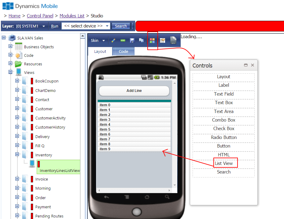
ListView
The ListView control allows the devleoper to display array of objects in a kinethic scrollable list. The ListView control can be bind to the data model’s property by
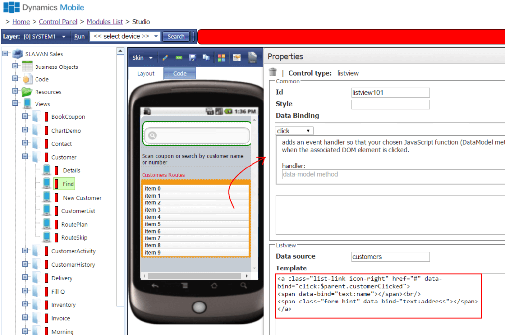
The Data Source field must point to array property of the data model. The data model for this view could look like:
dataModel:function(){

var me = this;

this.items = ko.observableArray();

this.selectItem = function(selectedItem){

$ma.uiManager.alert("the user clicked item with no :"+ selectedItem.No);

}

}
The Template field in the ListView properties contains HTML template defining the layout of each line within the listview.
Here the example assumes that each line is clickable , so it is rendered as element. We specify class=”list-link” to have specific type of rendering similar to the way the lists are rendered in the devices
In the data-bind attribute for the element we specify $parent.selectItem , which actually instruct the system that we want to call the selectItem function of the data model when the element is clicked.
The first element inside the element specify that it will be populated with the item’s Description property – e.g. it assumes that each object in the items array has Description property.
The second element will be rendered on the next line and will be populated with the No property of the item object. We use class=”form-hint” to make the second line a bit different in terms of color and font-size.
Note that you can use class=”list-link icon-right” class for the element to render the line with a right-arrow icon to show the user that the line is clickable